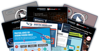
Last Tuesday morning, as you scrolled through LinkedIn, imagine your phone lighting up with a flood of notifications. That’s what happened to me when an infographic I created about cybersecurity myths suddenly went viral—thousands of shares, comments, and new connections. What’s surprising? It wasn’t my most polished design. Instead, it resonated because it told a story that felt real. After years of chasing “perfect” infographics with only modest engagement, this experience changed everything. Now, I see so many businesses—maybe even yours—making the same mistakes I once did with LinkedIn visuals.
Breaking Down What Actually Works
Here’s the truth about creating LinkedIn infographics: the most successful ones often break traditional design rules. That viral cybersecurity piece? It didn’t drown viewers in statistics or technical jargon. Instead, it used simple illustrations, real-world analogies, and a clear narrative. If you want your infographics to truly engage, focus on:
- Relatable scenarios: Show situations your audience faces daily.
- Unexpected insights: Share something that makes people think differently.
- Clear visual hierarchy: Guide the eye naturally through the story.
- Strategic whitespace: Make content easy to scan.
- Compelling data visualization: Turn numbers into meaning.
- Brand-consistent colors: Reinforce recognition.
- Scannable text blocks: Keep it concise and readable.
- Single clear takeaway: Make sure viewers remember—and want to share—one big idea.
But remember, even these elements only work when they come together to tell a story that resonates with your audience’s real challenges. If you’re in IT, for example, focus on the security concerns or tech hurdles your clients actually face. For more on how we help businesses communicate complex IT concepts, check out our IT support solutions.
The Psychology Behind Viral Business Visuals
A coffee chat with a behavioral psychology expert opened my eyes to what really makes LinkedIn visuals go viral. It’s not just about good design or useful information. It’s about tapping into “professional identity moments”—those instances when someone feels more competent or insightful at work because of what they’ve shared.
Ask yourself: What will make someone want to share your infographic with their professional network? Sometimes it’s a surprising statistic. Other times, it’s a fresh perspective on a common problem. On LinkedIn, people share content that makes them look good to their network. That’s why understanding your audience is crucial. If you’re in the tech sector, for instance, consider how your visuals can help your peers solve everyday IT challenges or stay ahead of cybersecurity threats. Dive deeper into the importance of cybersecurity storytelling to see how we help clients craft content that gets noticed.

The Technical Side Nobody Talks About
Let’s get practical. After a week of testing image dimensions, colors, and text sizes across devices, I learned a hard truth: most infographics are designed for desktop, yet over 60% of LinkedIn browsing happens on mobile. If your infographic isn’t mobile-optimized, you’re missing out.
Here’s what works best:
- Shorter heights: Infographics that don’t require endless scrolling get more engagement.
- Larger text elements: Easy-to-read text ensures your message isn’t lost on small screens.
- Vivid, high-contrast colors: Colors that “pop” on mobile drive more shares.
- Simple details: Skip tiny icons or intricate graphics—they won’t be seen on phones.
If you want to see how we optimize content for every device, our managed services page is a great example of visual clarity and accessibility in action.
From Data to Story: The Art of Visual Narrative
The biggest mistake? Treating infographics as dumping grounds for data. A tech company recently asked us to review their LinkedIn strategy. Their infographics were packed with statistics but lacked a story. We helped them reframe their visuals around a “day in the life” of their target customer, showing how their solution solved real-world problems. The result? Engagement soared by 400%. People shared because they saw themselves in the narrative.
It’s not about having the most data or the fanciest design. It’s about creating a visual narrative that connects with your audience’s reality. For more inspiration, see how we help retailers use story-driven IT strategies to reach their customers.
The Future of LinkedIn Visual Content
Looking ahead, the smartest businesses are shifting toward “value-first visuals”—infographics that teach, inspire, or solve real problems. The tools keep evolving, but the differentiator is how you present information in a way that genuinely helps your audience. Working in IT, we know even the most complex technical concepts can be approachable with the right narrative.
The future belongs to companies that understand their audience’s challenges and can translate complex ideas into visually compelling stories. If you want your visuals to stand out—and drive results—focus on professional insight and genuine human connection.
Ready to elevate your LinkedIn visual strategy or need help transforming your IT messaging into shareable stories? Contact eMazzanti today to learn how we can help your business connect, engage, and grow.


